VDP Design Strategy
“Let’s redesign that!”
“Redesign” is a word that I hear thrown around a lot, especially by designers (myself included). Design is never finished on the web, there’s always something to fix, something to make better, and something new coming along. But redesigning a site or a page or a feature that gets used by thousands of people daily is always risky, especially when it’s a critical part of a shopping or conversion funnel.
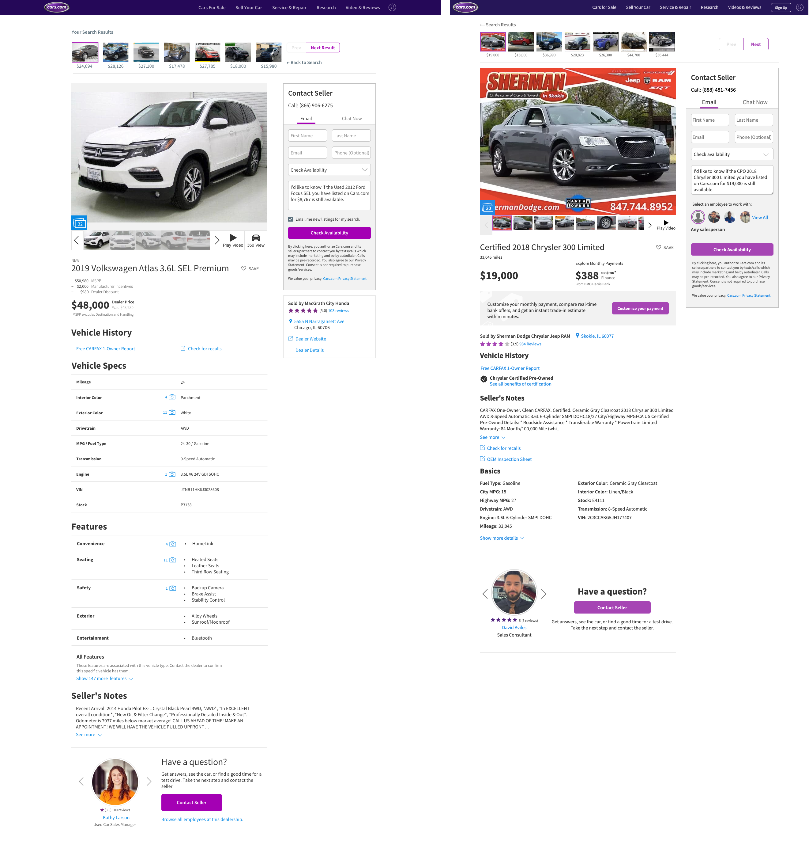
Being responsible for the Vehicle Details Page (VDP) of Cars.com, I needed to maintain a long term vision and design strategy for the page. Seen here is an example of a holistic redesign I kept and maintained as a perpetual carrot that the team kept chasing and refining.
Design is Never Finished
The reality was that we were never going to entirely redesign such in important page in one massive overhaul. Whenever something was changed, it was important to be able to measure the impact of that change. On the flipside, only ever changing small pieces at a time, it wasn’t hard to end up with a patchwork page with various parts all designed at different times having their own distinct nature and feel. Mainting that overall vision of the page was my way of avoiding that trap. I found it helpful to always have that ephemereal future state at the ready to pull out whenever discussion turned to the future of the page.
It was also important that each feature and section of the page could be designed, implemented, and tested independently. This ensured we had a viable path to making progress and be confident that we were improving the experience of our users and providing value to the business as well.
Measure and Improve
A redesign should never be taken on for the sake of a fresh look. Why spend all that time and money unless you believe you will end up with something better? And to know if you ended up with something better, you need to be able to measure, well, something.
As we built and learned, all the research and user complaints and metrics we tracked informed the design. Everything you see in the redesigned page was changed because research or feedback told me it needed to be improved.
 Redesign on the left, old on the right. The redesign was done mobile first, but it’s easier to see the differences at a glance on desktop.